
.png)
Simple Tech Talk was a startup concept created to help bridge the gap between top technical talent and the recruiters tasked with finding them. One recurring challenge we observed across the industry was the increasing volume of fraudulent resumes and duplicate profiles...especially in a rising remote-first hiring landscape.
As part of our broader platform vision, I prototyped a candidate verification tool, a simple utility recruiters could use to confirm whether a prospect’s credentials aligned with real digital signals. While this project never launched, it laid the groundwork for something much larger years later.
.png)

This was a 4-week self-led sprint. While my co-founder Ricardo helped spark the idea and led the technical development, I independently led the UX research, product flows, and interface design.
At the time, I had no direct access to recruiters. I instead observed forums like Reddit and Hacker News, collecting quotes and common complaints, and turned those patterns into affinity maps and design assumptions. This was a speculative but sincere attempt to solve a problem we believed was worth tackling.
“There are countless fake resumes out there, as well as fake candidates.”
That quote stuck with me. I didn’t just hear it once...it came up constantly. Every subreddit thread in r/recruiting, every rant, every LinkedIn post from a recruiter hit the same wall. People were submitting resumes that looked solid on paper but fell apart on closer inspection. Some weren’t even real people. Others were clearly copy-pasting experience. Some had portfolios with boilerplate projects from companies that couldn’t be verified.
To make matters worse, recruiters were spending hours trying to figure this out on their own. Many were googling, back-channeling, cross-checking links, or just making gut calls based on vibes. Not because they wanted to, but because the tools they had weren’t built for this kind of use case.
The deeper I looked, the more obvious it was. This wasn’t just an edge case, it was part of the day-to-day. Especially in remote-first recruiting, where anyone could apply from anywhere, with anything.
So I boiled the problem down to something that encapsulated the core of their issues:
Simple Tech Talk needs a way to help recruiters verify and authenticate candidates in real time to reduce wasted effort and fraudulent applications.
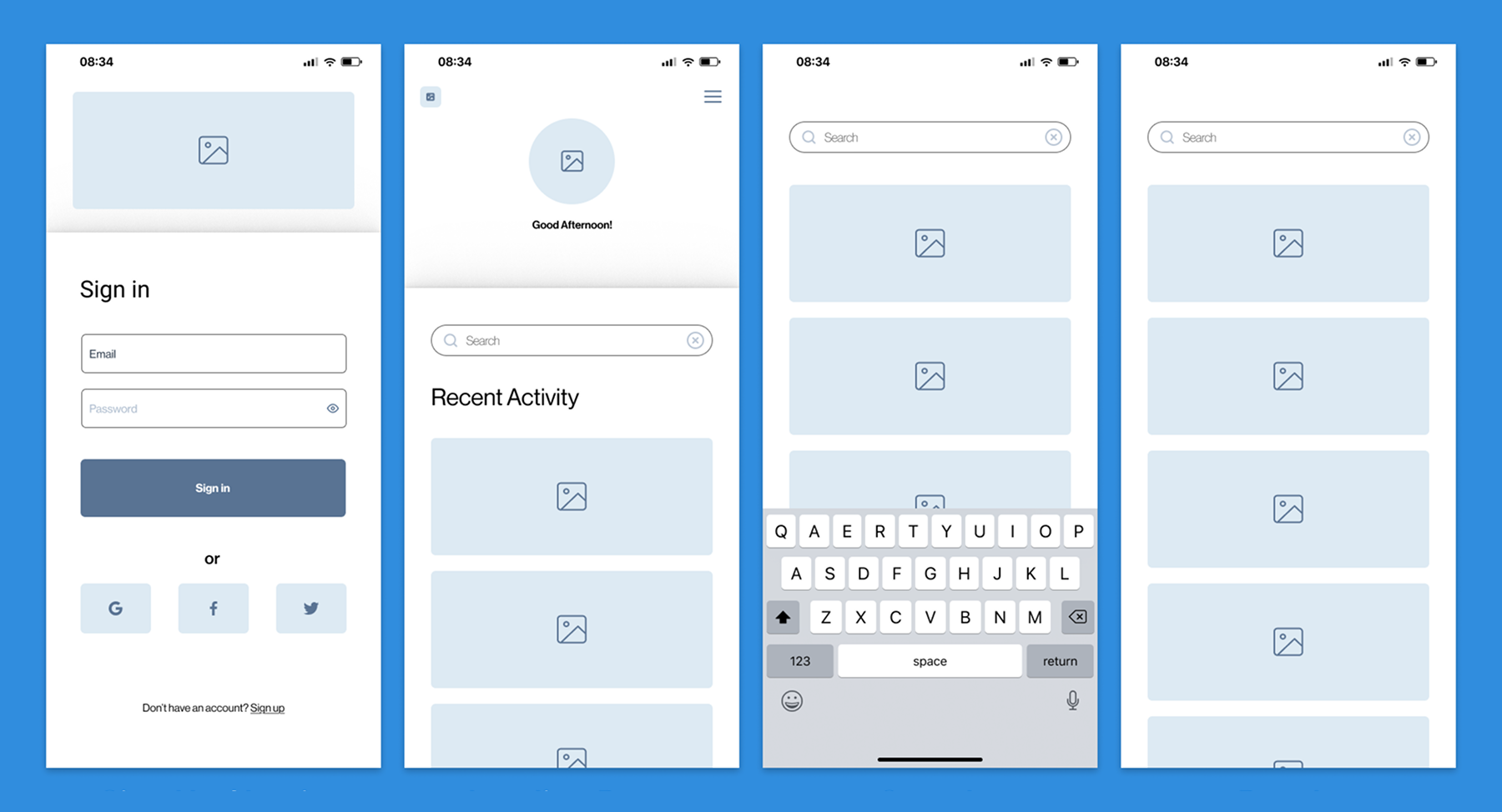
Here’s what the early version did:
Candidates had 5 minutes to verify. Recruiters could send up to 3 emails before the system marked them as unverified.
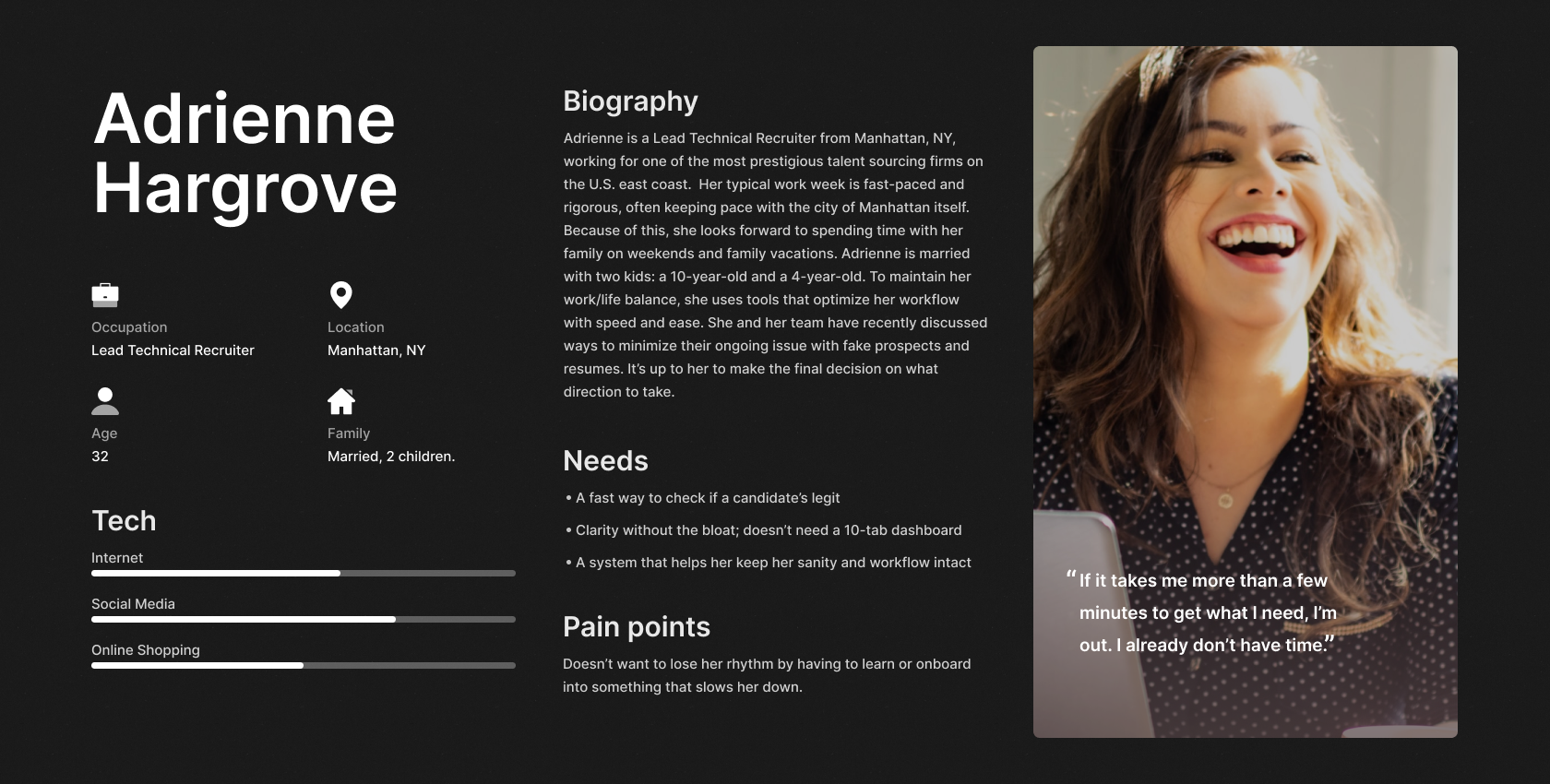
Based on the data I could gather, I created a persona named Adrienne to keep myself focused and grounded in reality. She wasn’t just a cardboard cut-out. I built her based on the type of people I imagined using this tool every day. Recruiters who were seasoned, stretched thin, and constantly switching contexts.
Adrienne was a Lead Technical Recruiter working out of Manhattan, married with two kids, and balancing a high-pressure job with a tightly protected personal life. She was the kind of person who didn’t have time to sit through a 30-minute onboarding video or dig through tabs of candidate metadata. She needed fast answers, clear signals, and a UI that didn’t slow her down.
Pain Point: Adrienne doesn’t want to lose her rhythm by having to learn or onboard into something that slows her down.
“If I have to waste hours learning your tool, it’s not worth it. I already don’t have time.”
To this day, Adrienne continues to speak to the ever-growing reality that recruiters still face, especially in today's day and age.
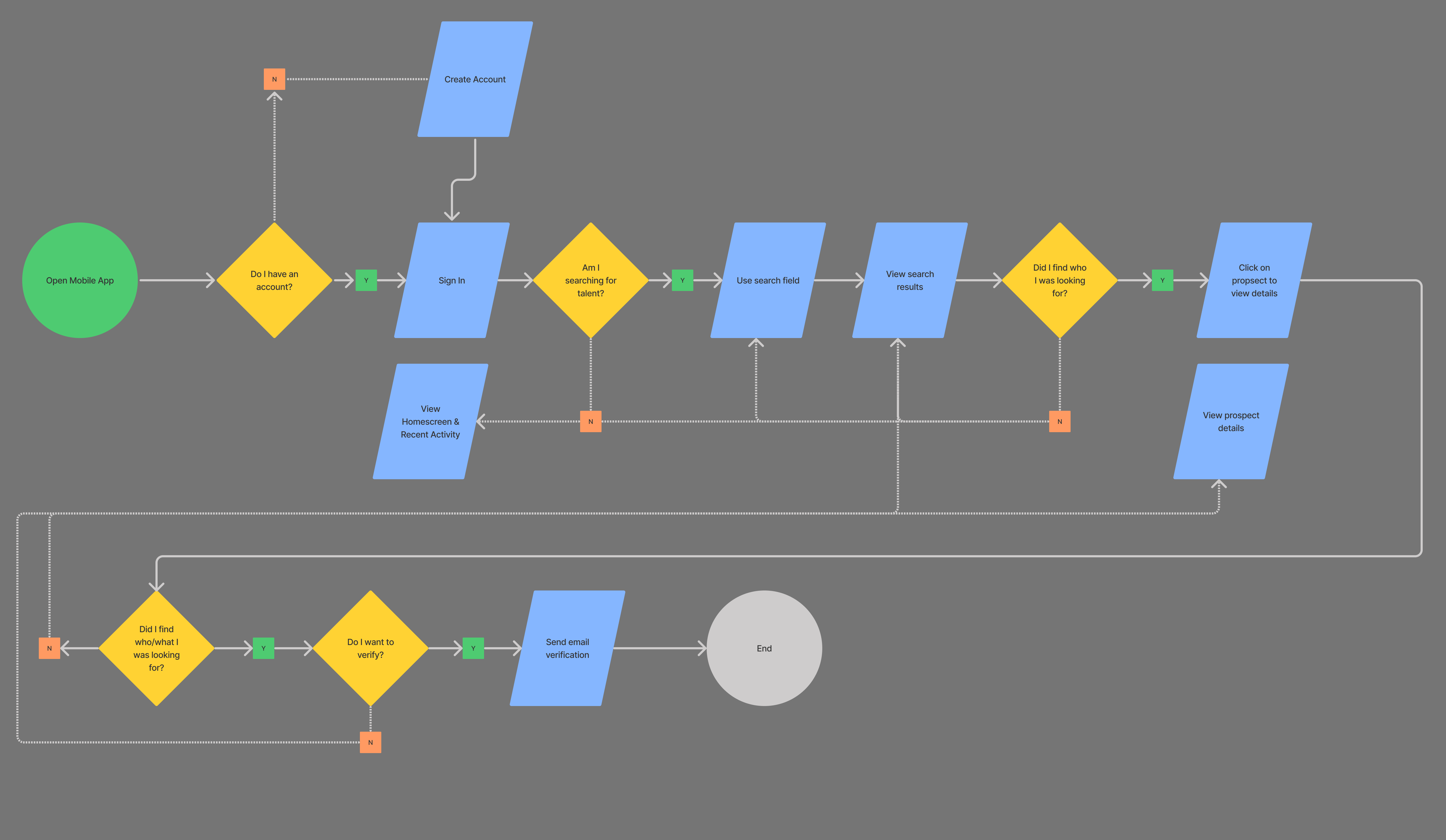
I needed a way to visually map out how a recruiter would move through the product, from a realistic standpoint. The flow started from the second they opened the app. Does the user have an account? If so, cool...log them in. If not, run them through a quick account creation process.
Once logged in and brought to the Landing Page, users would meet our first decision checkpoint: Are they actually here to search for talent? If so, begin the search.
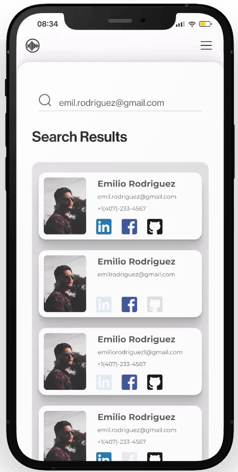
They hit the search bar, drop in a name, email, or phone, which would initiate the candidate search process. If they find the candidate, they click in to view more. If not, they loop back to search again. Simple.
Once they’re inside a prospect profile, they have a choice to make: Do I want to verify this person or not? If so, the system sends out a verification email that expires in 5 minutes. Otherwise, it drops them back to their recent activity feed.
I wanted to keep the experience tight and seamless. No dead ends, or unnecessary fluff. Just a clean loop that respected the recruiter's time and mirrored how they'd realistically use the tool. It wasn’t the "bells and whistles", but it made sense.
I ran six usability sessions with peers and non-recruiters. Five users found the system intuitive, though one missed that the Recent Activity panel was scrollable (which I later addressed).
It was the sixth session that challenged everything with a single question:
“What if the candidate has multiple emails… or gives someone else access?”
This exposed the prototype's weak trust model. I realized that while the interface flowed well, the product logic lacked depth.
We began asking more critical questions:
This project didn’t make it to production, and looking back, that was a good thing. However, it forced me to confront some things head-on.
First, I learned that good UX can’t fix a broken concept. The prototype looked clean, and the flows made sense, but the logic behind them was shaky at best. Verifying someone’s email doesn’t equal verifying who they are. That was a stinging reality to sit with after the sixth usability session.
Second, I realized how easy it is to fall in love with your own idea. I'd fallen prey to my own tunnel vision. I thought the biggest problem was just saving recruiters time. But it was much deeper than that. Recruiters wanted to know if they could trust someone. That’s a different problem altogether.
Lastly, I saw the limits of designing in a vacuum. Without real recruiters to test with, I built off patterns and assumptions. Some of those were solid. Others? Not so much. This experience made it clear: real insights don’t come from scrolling, they come from conversations.
If I could go back, I would’ve built a scoring system from the start. Not a “yes/no” check, but something layered, based on signals, behavior, and context. Something a recruiter could actually use to make a call.
And that’s exactly what SimpleVerify is becoming.
This was the first time I really tried to solve a real-world problem through design. This was a real problem, built off of real pain points. It's true, I didn’t have users, or didn’t have real data. I gathered the data that I could, and simulated the rest based on trends and educated guesses.
This project gave me just enough traction to learn how to fail fast and build clarity. It exposed my blind spots. It made me slow down and think deeper about what makes someone trust a candidate. It gave me a framework to challenge myself later when I had more tools, more experience, and more access.
Years later, I came back to this same idea. But this time with real product instincts, a technical co-founder, and a sharper understanding of what hiring teams actually need, not just what looks good in a prototype.
That product is now called SimpleVerify.
→ See the evolution: SimpleVerify Case Study

